D r e a m   B i g .

K
a r l
K
n u t t e l

Go back home

Hailan Restaurants.

Hailan website
Hailan website
Hailan website

The Project

Hailan is a small chain of restaurants in Dublin that serve authentic Korean, Chinese, and Japanese food. I was hired to redesign and develop their website, redesign their logo for the web, and a contribute to the business' online branding. The layout needed to be fully responsive and the content SEO friendly.

Visit Site →
Role:

Web Designer/Developer/Logo Design/Branding

Context:

Business Website

Period:

Late 2017

Design

The client's previous web portal was very simple and visually basic, and their real-world brand identity varies from restaurant to restaurant. The primary challenge was to tie together the dispirate identities into one consistent and cohesive web brand.

The restaurants themselves are somewhat underground hidden gems and have received many great reviews in a variety of magazines and papers for their truly authentic food. This sets them apart from most Asian food places in Dublin. This should be the focus of the site: show how different the restaurants truly are to their competitors.

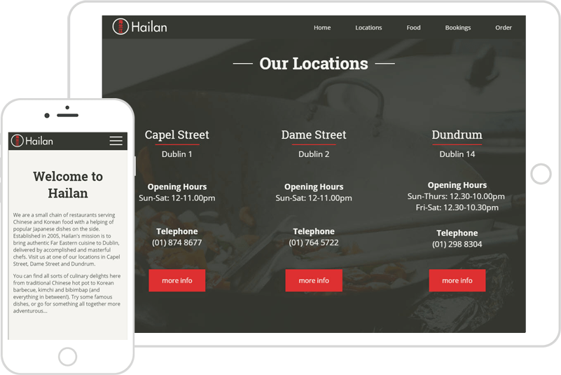
The tone of voice, then, is informational, authoritive, and illustrative. And to play to the perception of 'cool hidden gem' the tones should be muted with one strong accent color. 
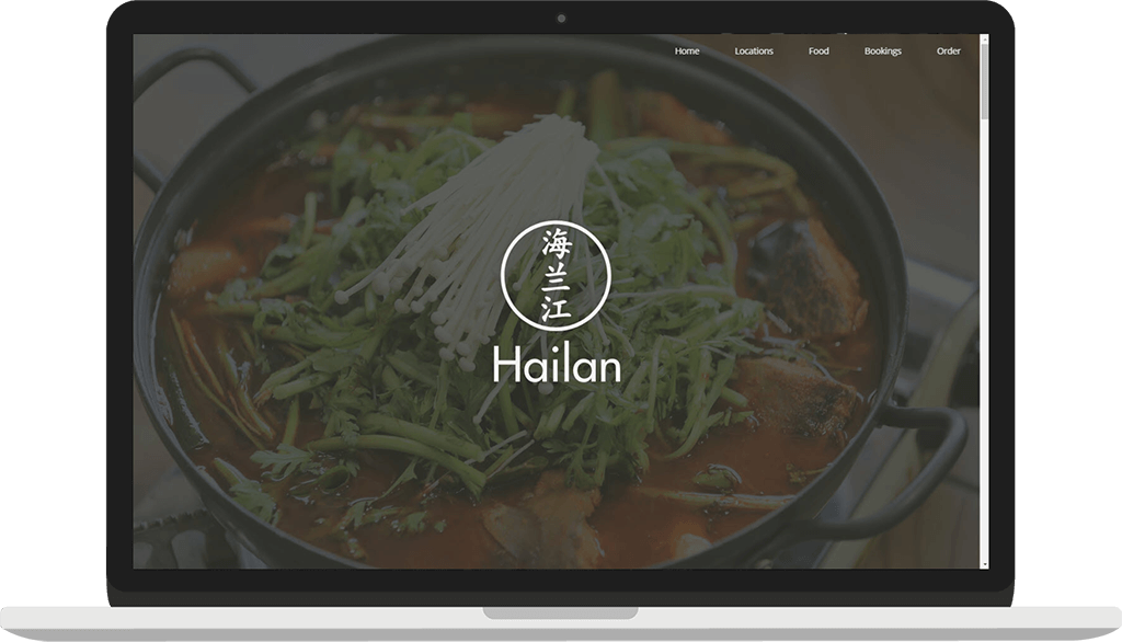
New information should be revealed to the user as they scroll, simuating the real-world experience of discovery.

$jet

$shadow

$geranium-lake

$eggshell

$isabelline

Roboto Slab Roboto

As the owners of the restaurants are Chinese, of course the primary accent needed to be red! This set against more muted background colors, besides being beautiful, gives prominence to the important calls to action. This allows the rest of the canvas to be visual, with images of the cooking and restaurant locations hidden behind muting overlays. Images of food can then pop against a visually intertesting background.

The tone of voice could be represented textually through contrasting yet complimentary typefaces. A strong slab serif for the headings and a softer sans serif for the copy.

Finally, the logo needed to be simple and elegant embracing both Western and Asian. Futura was chosen as the logo's typeface, with a 'Kaiti' brush script style Chinese font making the logo's centre.

Hailan viewed on Apple devices.

Development

The site was developed entirely from the ground up using CSS grids and flexbox with Sass and NPM. It's entirely responsive, taking a mobile-first approach. Mobile-first was chosen mostly because a large proportion of people looking for somewhere to eat use their devices, but partly as a fallback for the minority of users whose browsers don't support CSS grid.

jQuery and Javascript was needed for the site's functionality, in particular for animations and for the parallax backgrounds.

The use of a CMS was discussed with the client, but it was decided that the site wouldn't be dynamic enough to warrant it. The integration of a booking system was also discussed and partway developed. However, the client decided that it wasn't necessary in the end. It is likely that the site will be further developed in the future, (most notably in terms of menus and pricing aspects) so it was developed with expandability and reusability of code in mind. The use of CSS grids allowed for extremely streamlined and elegant code that can be easily expanded or translated for a CMS.

Skills

I was responsible for the entire design, branding, and development of the site. I created wireframes and mockups during the design stage.

The main skills and technologies used were:

HTML5

CSS3

jQuery

SCSS

BEM

Photoshop

Illustrator

VS_Code

Nodejs

Gulp

View Next Work